Charts
Whatever your craft, use these temperature by year charts to create new items or modify your existing designs with accurate global temperature colourways. See the Craftivist Showcase for suggestions of other climate charts used by other craftivists.
Click to view the spreadsheet of the charts with the following tabs
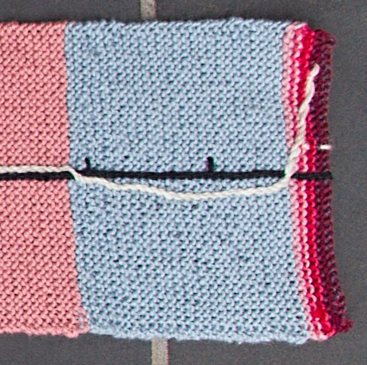
Tab 1: Temperature band per year charts used for the Accurate 100 year scarf shown above.
Tab 2: A copy of the official #ShowYourStripes temperature variance per year data with assigned RGB colour codes for crafts that can select exact digital colours (as of June 2025).
Tab 3: A scarf pattern for complete beginners using a simplified chart and instructions with video links for both knitting and crochet.
Tab 4: Instructions for modifying your own beanie/toque pattern to show warming stripes
Tab 5: Suggestions of colour combinations and yarns.
Tab 6: Temperature band per year chart for creating the IPCC scarf shown below.
Tab 7: Temperature band per year chart for creating the XKCD scarf shown below.
Tab 8: Comparison of different temperature per year charts at different levels of granularity compared with the official Warming Stripes
3 Types of Charts
Temperature charts are available for three different types of graphics spanning different time periods:
-
22,000 year XKCD Earth Temperature timeline
-
1920-2022 Warming Stripes or #ShowYourStripes graphic
-
1900-2100 IPCC 2023 graphic
Across the range of charts, there is an answer to most scepticism about human induced climate change, both in the past and into the future.
Alternatively, use the data that is significant to you, such as biodiversity data or glaciogenic data.
22,000 year XKCD Earth Temperature Timeline
The above graphic is part of a whimsical but accurate representation of the global temperatures since the last ice age created by xkcd.com. Made in 2016, it illustrates that, some time in the last decade, global temperatures moved higher than the 'Goldilocks zone' for human development that we have been in for at least the last 10,000 years.
Temperature per years charts for this graphic are available in a separate tab in the spreadsheet.
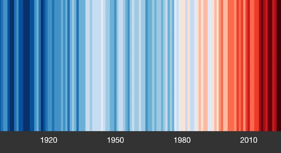
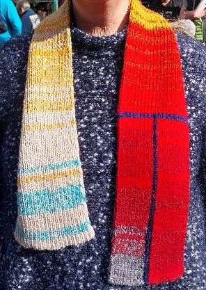
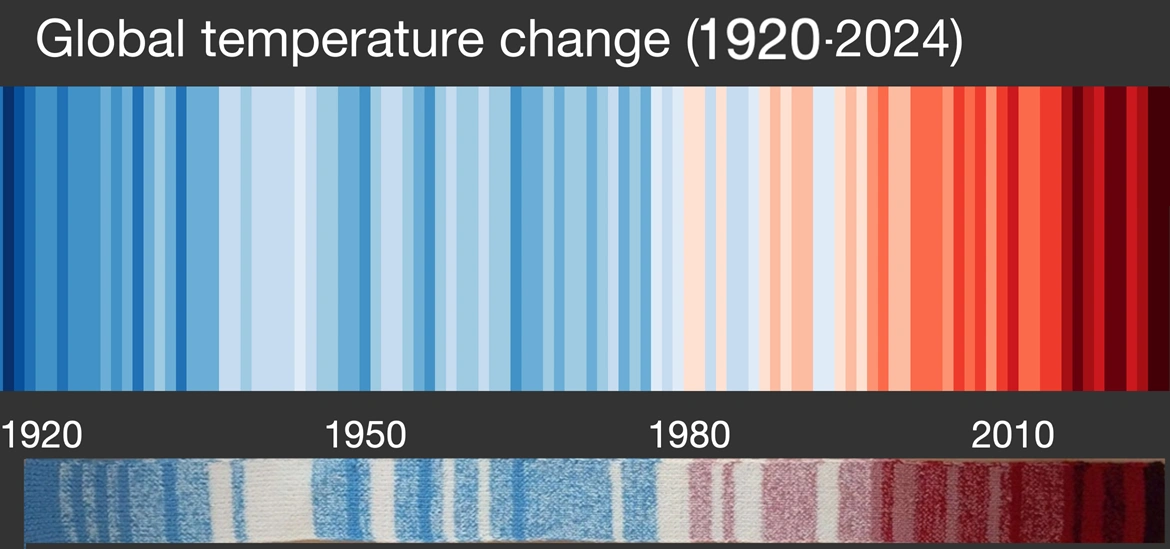
100+ years Accurate Warming Stripes
This #WarmingStripes or #ShowYourStripes graphic is a visual representations of the change in global temperature over the past 100+ years. It uses a 18 shade blue-red gradient to indicate the rise in average temperatures. Temperature per year charts are available for variations of this graphic suitable to use in craft projects.
There are various levels of granularity, produced by combining groups of 2, 5 or 6 of the 18 shades to create charts using 9, 6, 5, 4 and 3 colours suitable for multiple crafts. Your choice of which to use will be influenced by the level of accuracy vs. artistry, and complexity vs. completion speed desired.
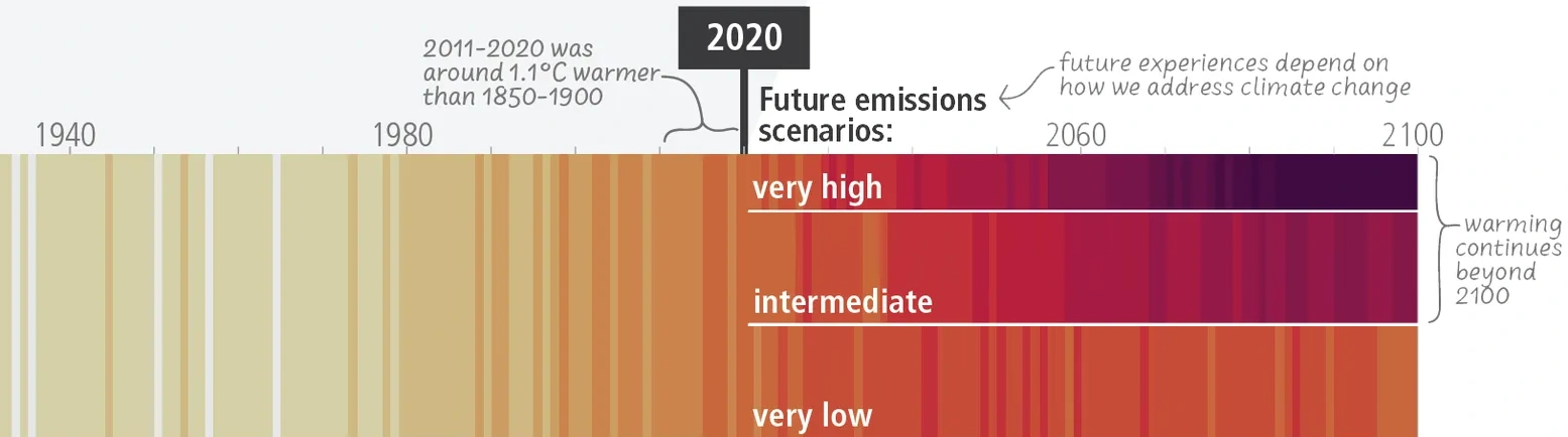
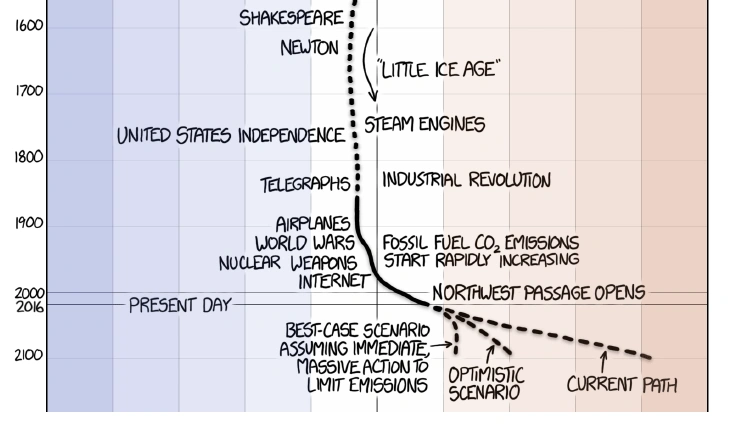
160-200 years IPCC 2023 chart
Click this link for the original of the IPCC image shown above. The Intergovernmental Panel on Climate Change (IPCC) is the international body of scientists that proposed the Kyoto accord and the Paris targets for carbon emissions. Their 2023 report included the above graphic, with five future scenarios of potential future temperatures depending on how rapidly the world weans itself of carbon.
Temperature per year charts are available in a separate tab in the sheet for some of these future scenarios. As with the XKCD chart, the world's 'current path' is the worst scenario presented.
For 3 Types of Scarf
22,000 year XKCD Earth Temperature Timeline scarf
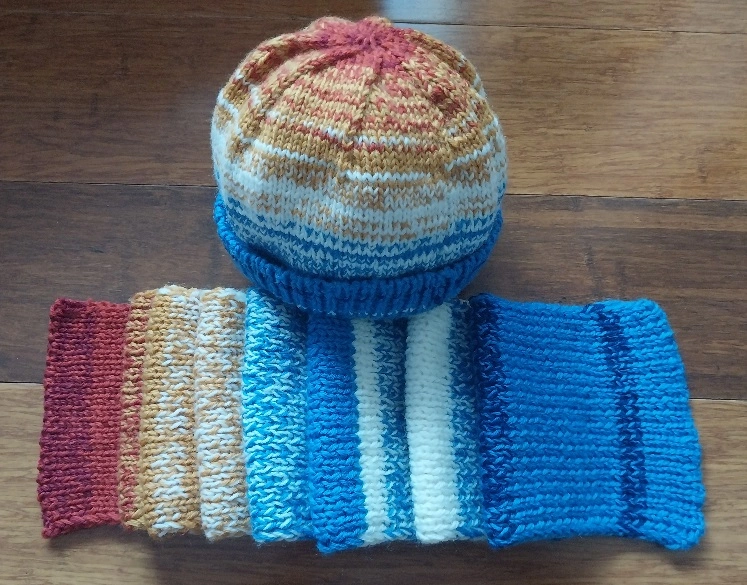
100+ years accurate Warming Stripes scarf and beanie